
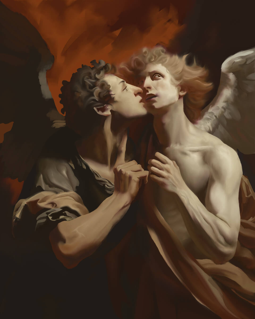
The Making of Whispers of Rebellion
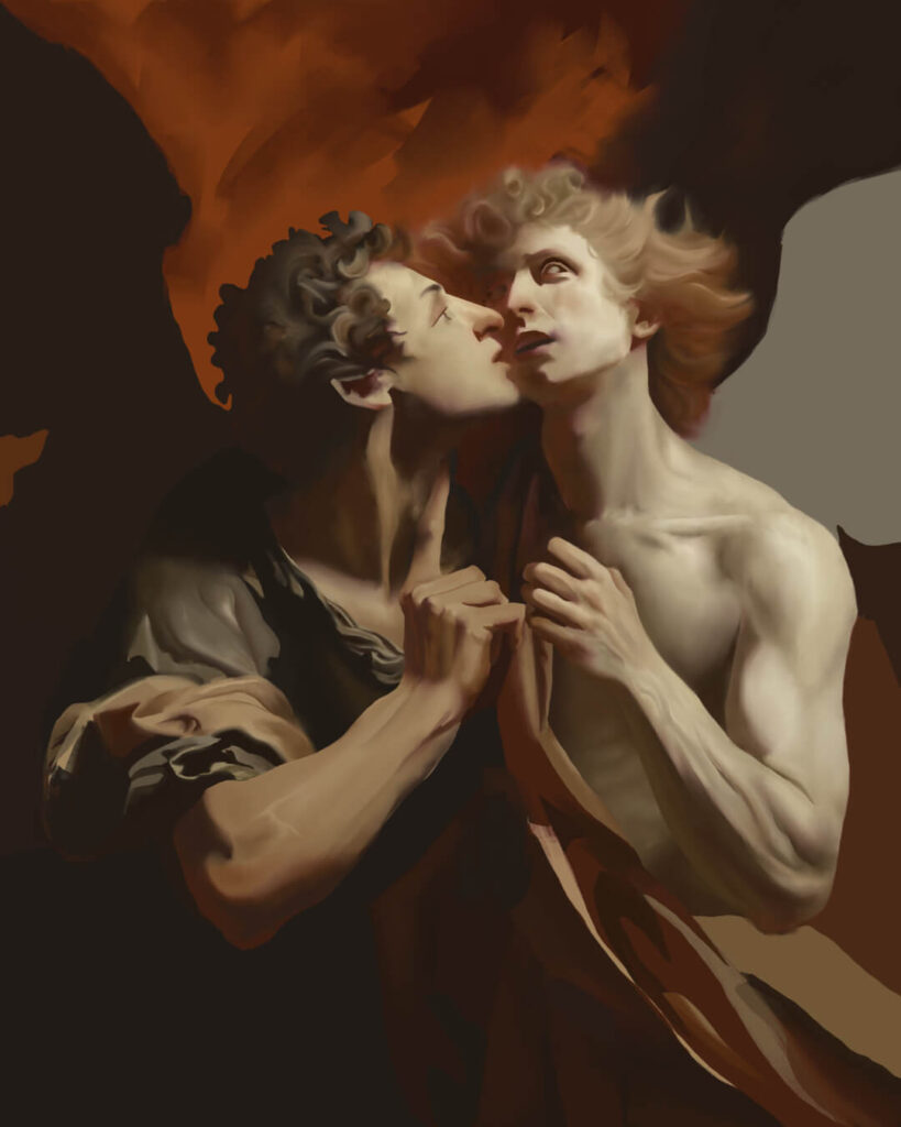
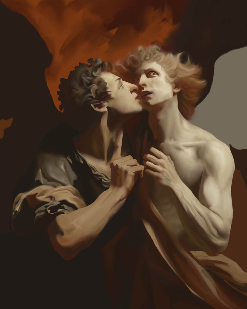
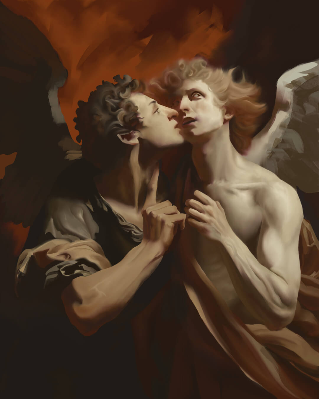
Whispers of Rebellion is a depiction of ultimate deception, capturing the allure of defiance and the tragedy of those who, in striving to touch the divine, fall prey to their hubris. It explores power, freedom, and the high cost of ambition.
In this post, I’ll give an overview of how I developed the concept, composition, and color palette for this piece. Then, we will walk through the stages of the painting process together. While catered to the intermediate artist, I’ve included links to external resources and knowledge panels for beginners to explore.
What Software Did I Use?
I created Whispers of Rebellion with Rebelle 7 Pro, a digital painting tool that simulates traditional media like oils and acrylics. I highly recommend giving the free trial a go if you’re looking to make the transition to digital or want to enjoy the feel of traditional media without the hassle of cleaning up.
Please note that if you make a purchase through the above affiliate link, I’ll receive a small commission, which helps support my work.
Concept
The idea for this piece came from thinking about Lucifer’s imaginary second rebellion against heaven, inspired by a C.S. Lewis quote from The Screwtape Letters: “The safest road to Hell is the gradual one—the gentle slope, soft underfoot, without sudden turnings, without milestones, without signposts.” This notion of a slow, silent descent felt more potent than the overt war of his first fall.
With that in mind, and drawing inspiration from the intimate feel of the figures in Caravaggio’s The Cardsharps, I settled on two sketches:
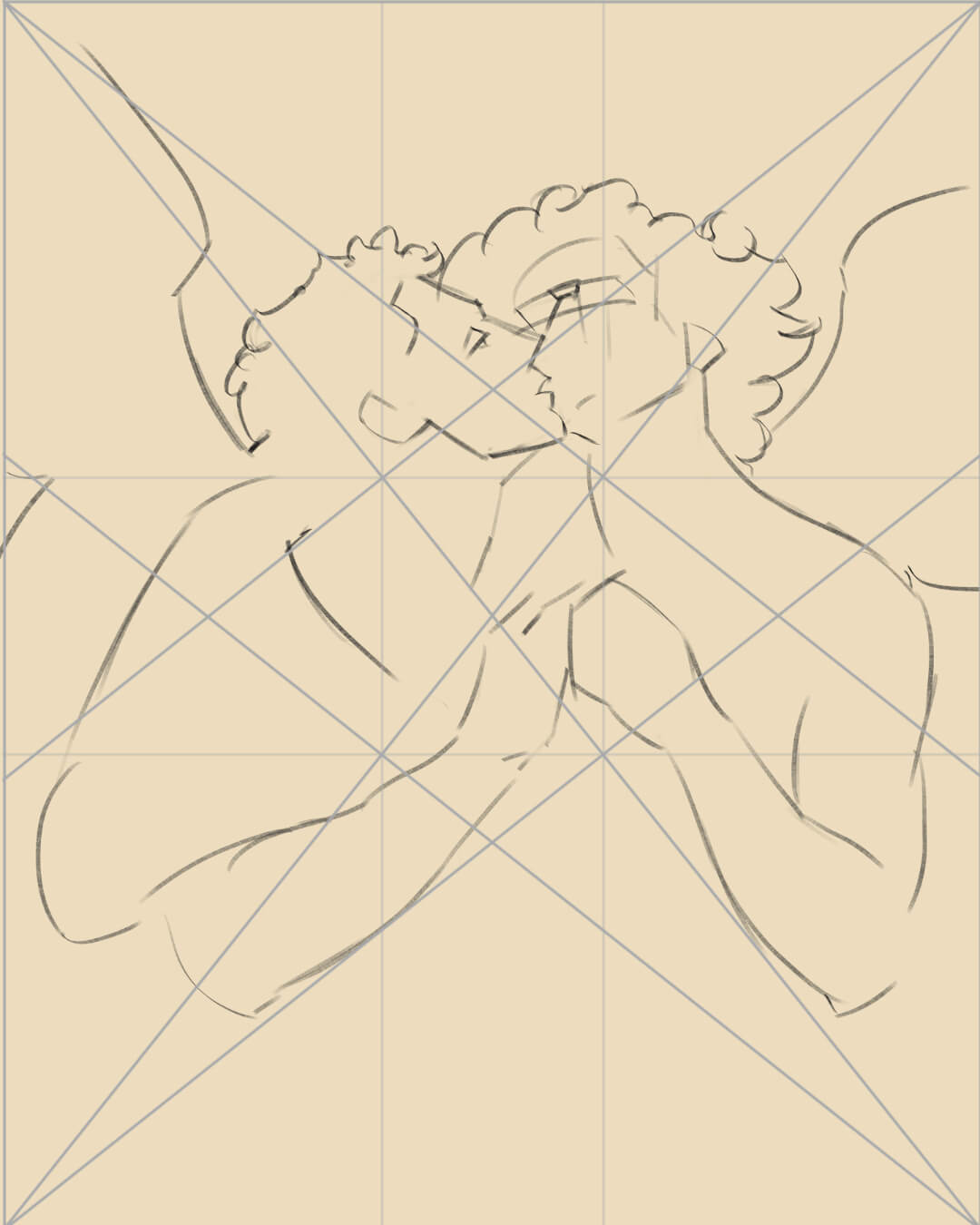
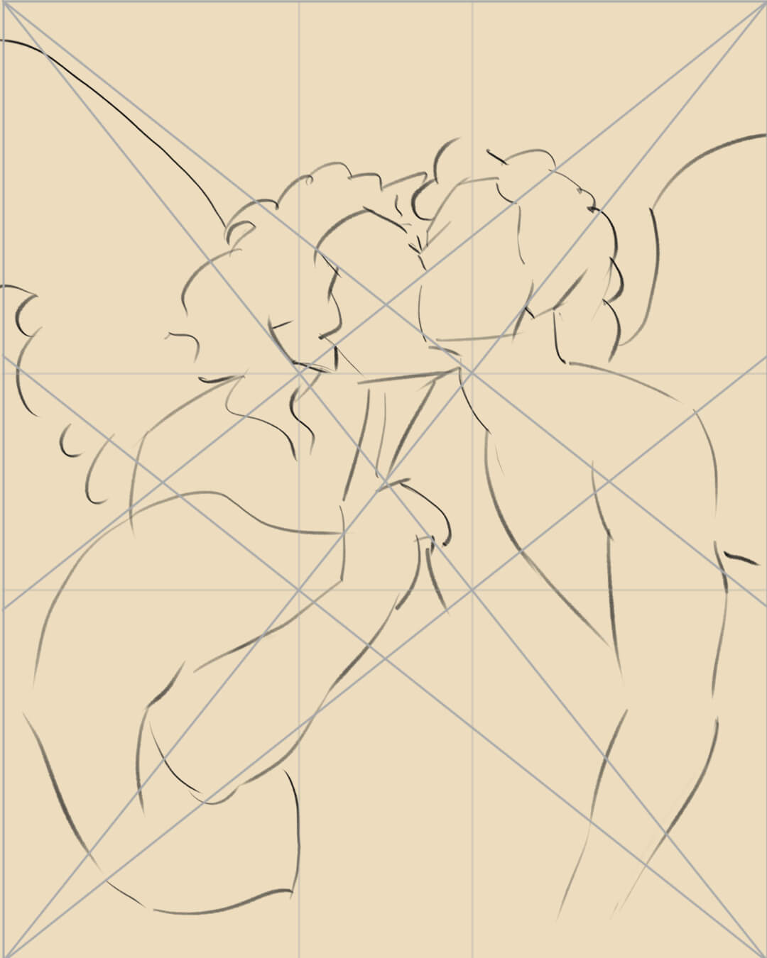
The intention was to capture a universal hinge point and compel viewers to fill the moment with their own conjecture of who would emerge victorious. It was also crucial that both figures share center stage, reflecting the equilibrium of power in their confrontation.
Composition
I use many resources to help create pleasing compositions during the thumbnailing phase. One of the most essential tools is this set of principles from Gestalt psychology:
- Law of Proximity: Objects close to each other are perceived as a group.
- Law of Pragnanz: Elements that are similar in appearance are perceived as more related than dissimilar elements.
- Law of Closure: The mind completes incomplete figures to form a coherent whole.
- Law of Continuity: The eye follows paths, lines, and curves, and prefers compositions that have a continuous pattern.
- Figure-Ground: The distinction between an artwork’s principal subject (figure) and the background (ground) helps effectively interpret shapes and space.
These “laws” play a prominent role in my design process and in deciding where to place important landmarks or points of interest.
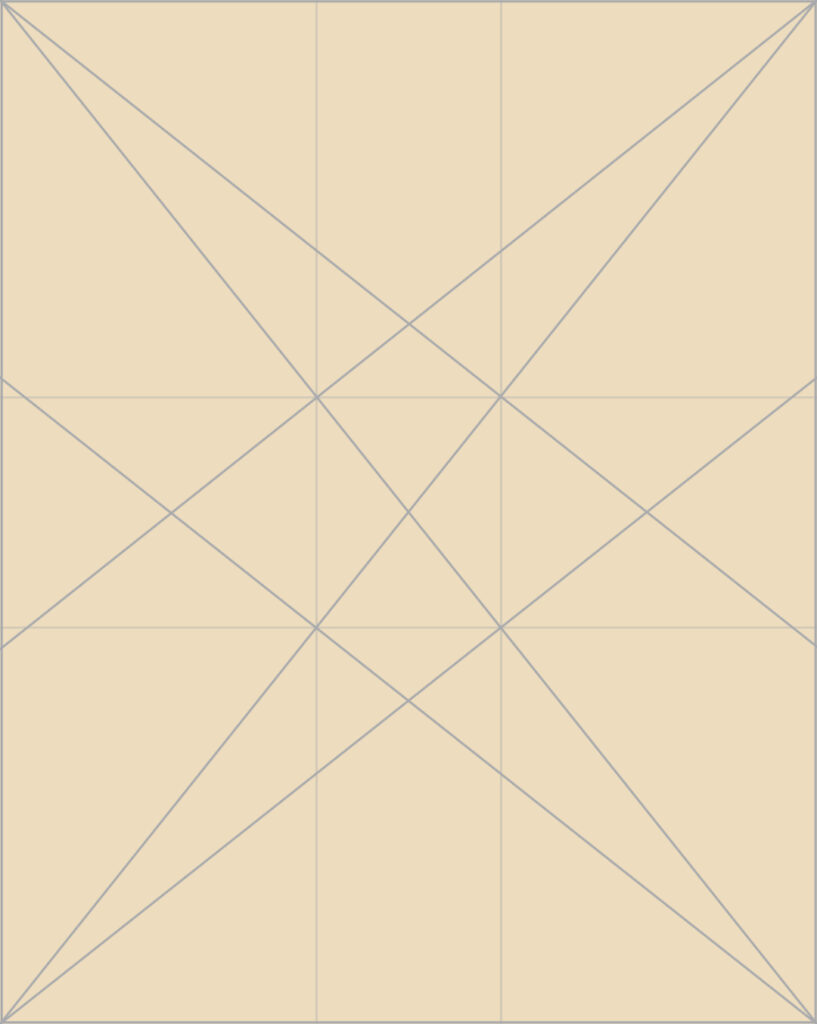
I also employ guides, specifically the Baroque/Sinister diagonal and a collection of geometric grids based on designs from The Painter’s Secret Geometry. This helps ease the blank canvas syndrome and takes some guesswork out of how to structure the scene. It also makes the law of continuity very easy to implement!
In this painting, for example, I used a spoke wheel composition in which important narrative elements are placed on major intersections, and lesser elements sit along or are relatively parallel to minor lines, directing the eye back to the main focal point(s).
There are many other compositional techniques one can use with these grids, like counter change, eye tracking, and repoussoir. Two books I highly recommend for digging deeper into composition are Imaginative Realism (specifically Chapter 11) and Framed Ink: Drawing and Composition for Visual Storytellers.
Color
Before developing a color scheme, I always ensure a pre-established narrative and thematic framework are in place. This helps streamline gamut mapping and makes the process less about experimentation and more about expression.
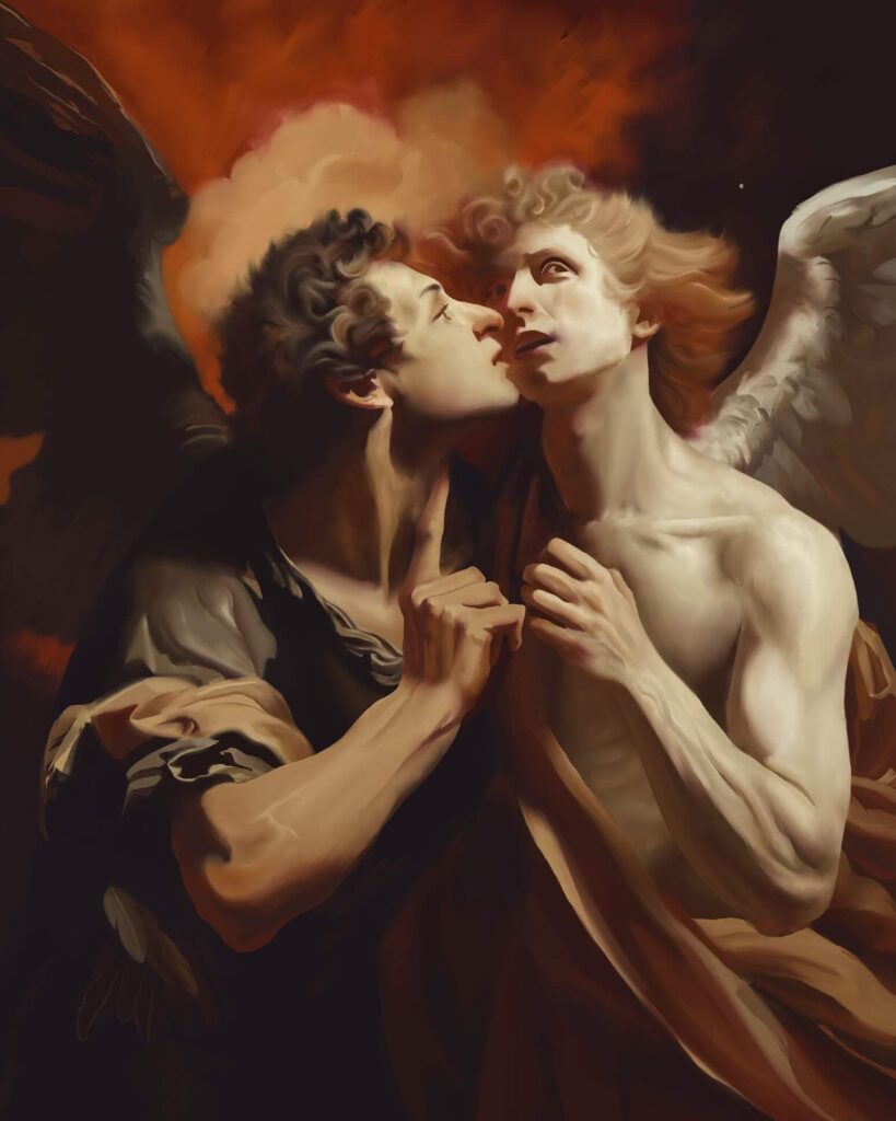
Metatron’s skin, for example, is rendered in modified titanium white to symbolize a being untouched by time or vice, whereas Lucifer’s pallor manifests his internal rot. The warmth behind them throws Metatron’s innocence into relief and essentially makes his purity a beacon of what is at stake in this gambit. Reflecting the gradual encroachment of Lucifer’s influence, the warm hue on the left side of Metatron’s face/neck also serves as a visual representation of the effect his words are having on the archangel.

Painting
What Brushes Did I Use?
For this piece, I used Flat Oily 3, Knife Dry, and Wet with no alterations, cycling through different blending modes to achieve the desired textures I was after.
While my current medium is digital, I use a process similar to that of a traditional painter as much as possible. I begin by mixing the secondary and tertiary hues on a “palette” layer. This reveals the range of hues achievable and helps me think about the other colors I might need to extrapolate from the initial hues.
Once I complete that, I start blocking in the shapes I’m going to paint for the session. I use the lasso tool and apply a clipping mask to lock my brush to the layer (see images below). I call this process “chunking.” This approach keeps me from sitting too long and helps me avoid the overwhelming pressure to complete the entire painting at once.
Rendering
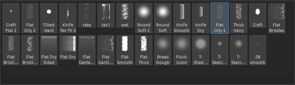
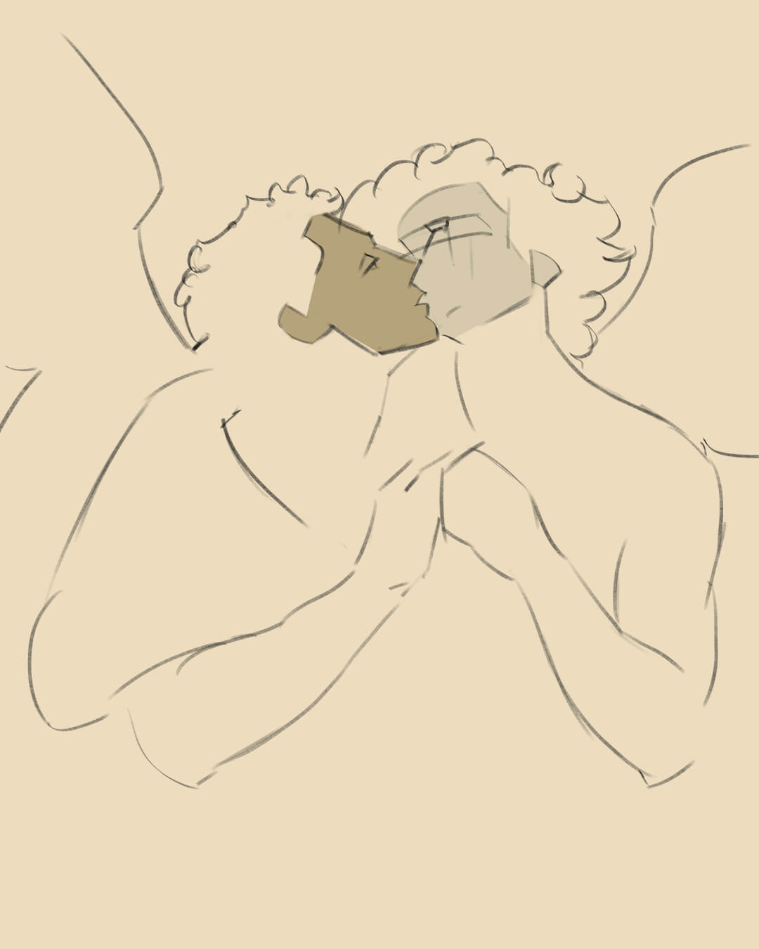
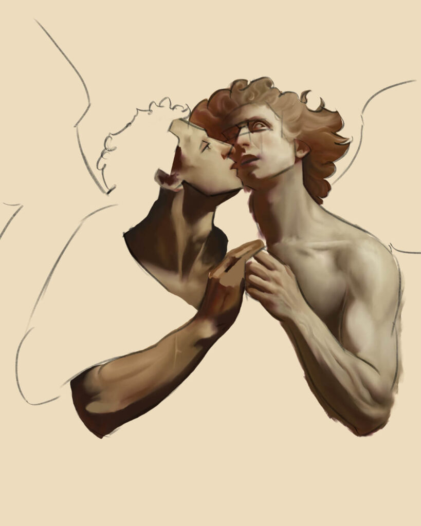
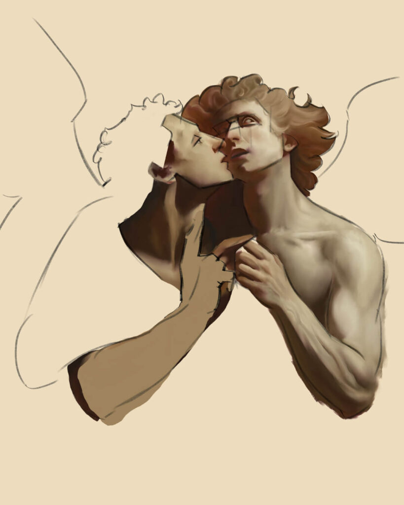
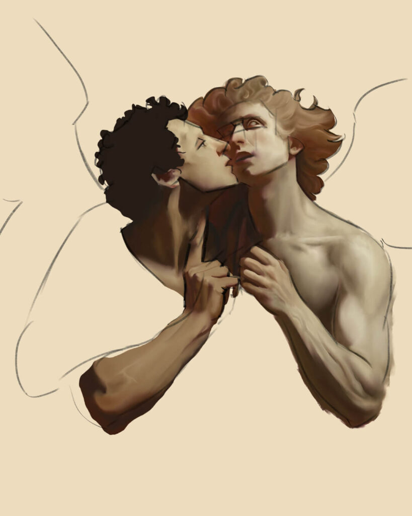
The left image below shows a simple block in of the faces’ local colors using the chunking method, with the beginnings of my rendering process on the right. I used a loose version of the Loomis method for Metatron’s face because the spherical framework and gentler curves lend themselves to a softer look. For Lucifer, I opted for a modified Riley approach to achieve a more chiseled visage. I used very few guidelines, but I had trouble finding the placement for Metatron’s eyes, hence leaving in the glabella and socket markers.
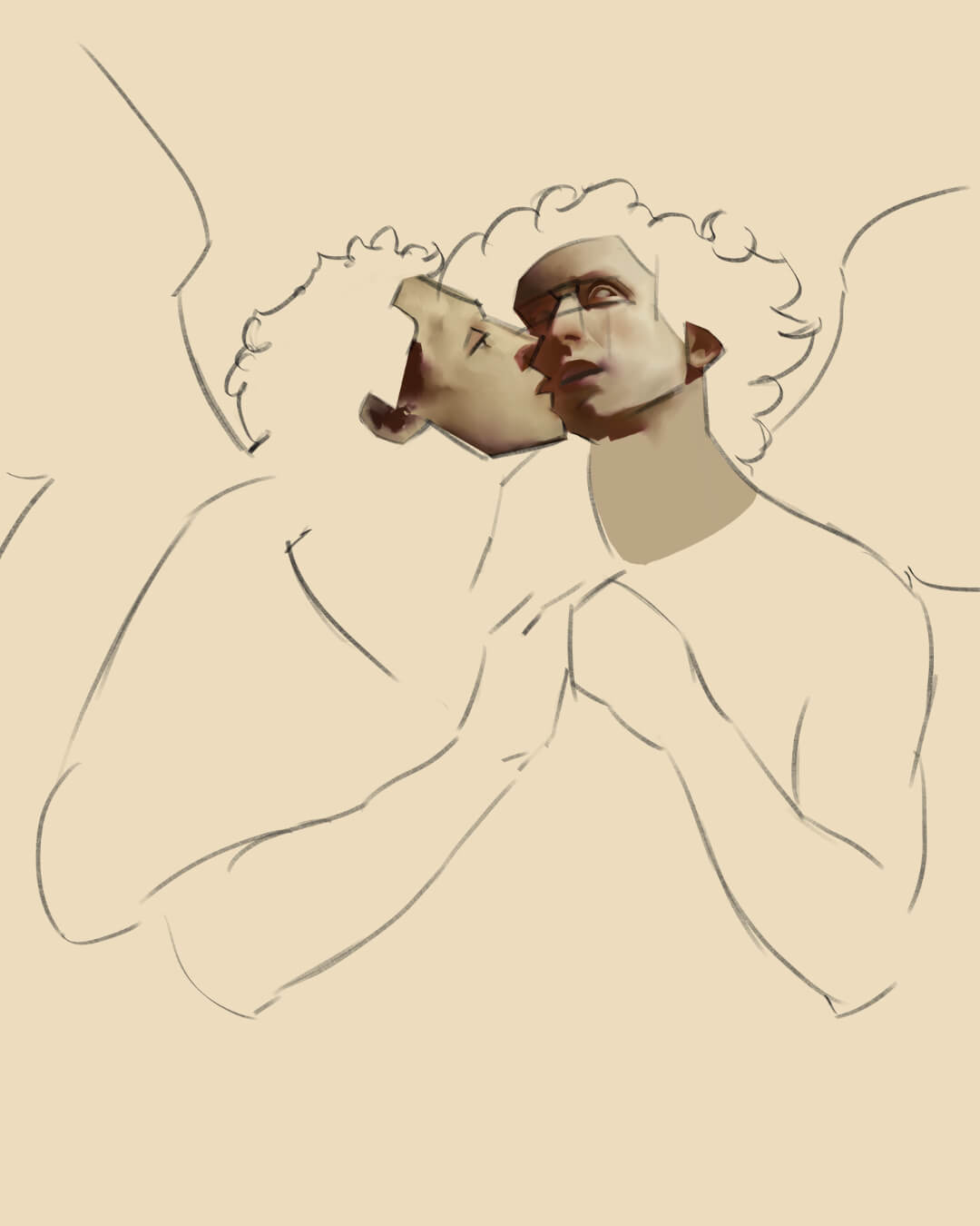
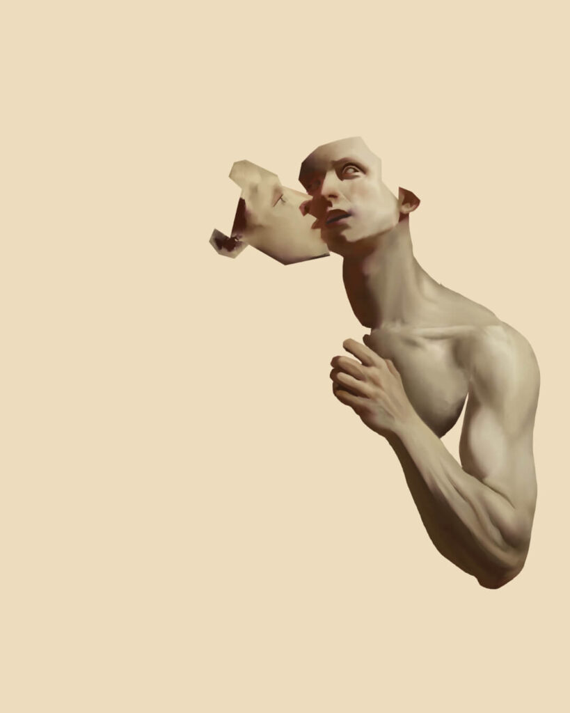
I then rendered the shoulder, biceps/triceps, forearm, and hand using the same lasso tool and clipping mask process mentioned earlier (I toggle the sketch on/off constantly but disabled it for these snapshots to keep the images clear):
The depiction of the neck changed many times throughout this painting because I struggled to decide how tense Metatron should be. Tension would cause the external jugular vein to be visible (jugular vein distention), but since he’s heeding Lucifer’s words, I settled on a relaxed pose.
Anatomy and Rendering
The note about veins might seem excessive, but anatomy is an essential part of rendering. This intermissionary section gives a breakdown of how I approached rendering the different muscle groups in these two figures.
Figure Drawing Design & Invention by Michael Hampton is an excellent resource for learning anatomy as an artist. If you don’t mind a heavier option, Gray’s Anatomy is hard to beat.
Deltoid
The deltoid muscle, which caps the shoulder, comprises three distinct sets of fibers: anterior, lateral, and posterior. Each fiber contributes to its triangular shape. I like to give my deltoids a subtle outline and exaggerate their size for a “bowling ball” look. In retrospect, I pushed the outline a little too hard in this painting, but it aligns with the portrayal of Metatron as having an idealized physique.
Biceps and Triceps Brachii
The biceps and triceps shape the upper arm. When representing these two muscle groups, I use elongated and contracted egg shapes, with the tricep egg flattening as it reaches the elbow. This approach makes rendering more straightforward and helps maintain the volume and consistency of the muscle depiction. I made Metatron’s biceps more pronounced and tensed to reflect his desire to attack Lucifer.
Forearm and Hand
The forearms and hands are complex regions because of the interplay of muscles and tendons that move across the joints. Anatomically, the forearm features two primary muscle groups: the flexors on the inner side, which close the fingers and bend the wrist towards the palm, and the extensors on the outer side, which open the fingers and bend the wrist back.
The hand’s structure includes the carpal bones (wrist), metacarpals (middle hand), and phalanges (fingers). I opted to emphasize the rendering of the forearm to accentuate the tension in Metatron’s action. Burne Hogarth inspired me to follow this concept of prioritizing the impression of movement and force over precise anatomical accuracy. His teachings in Dynamic Anatomy are well worth the read.
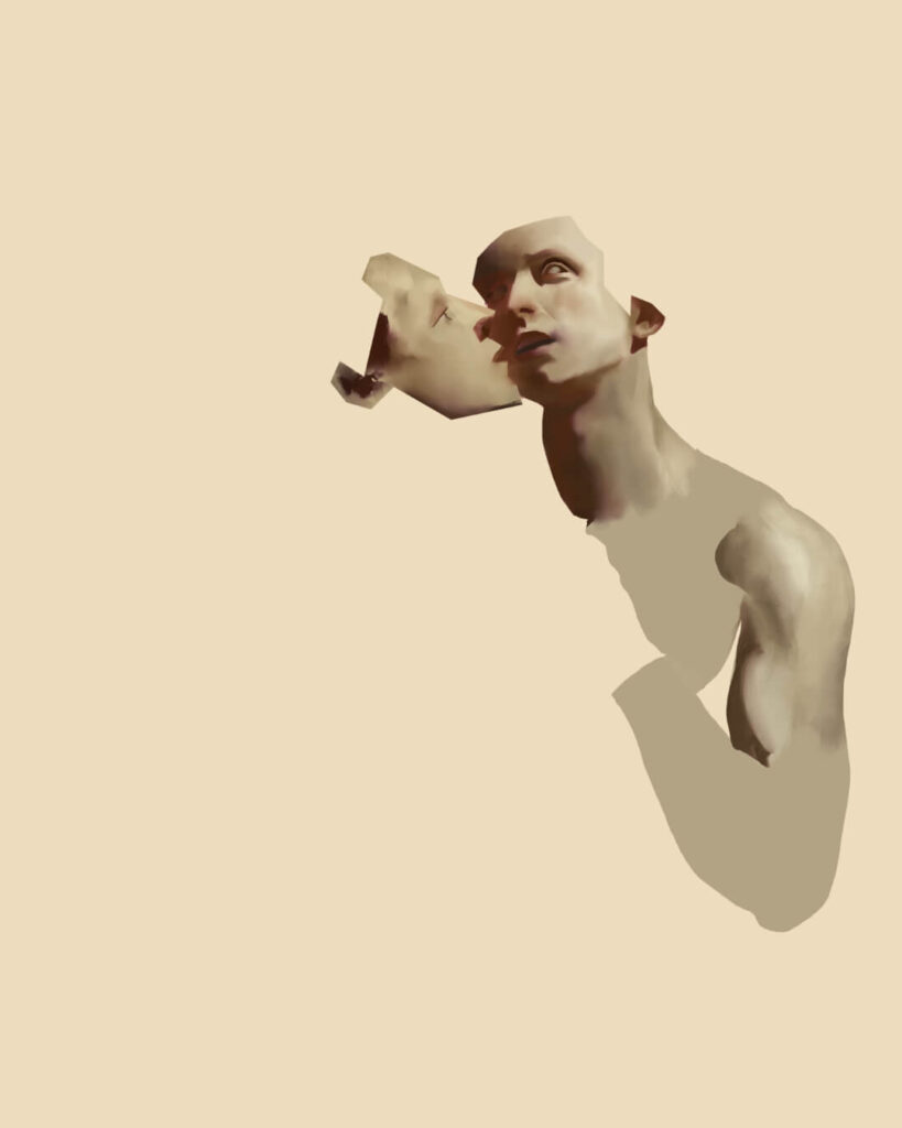
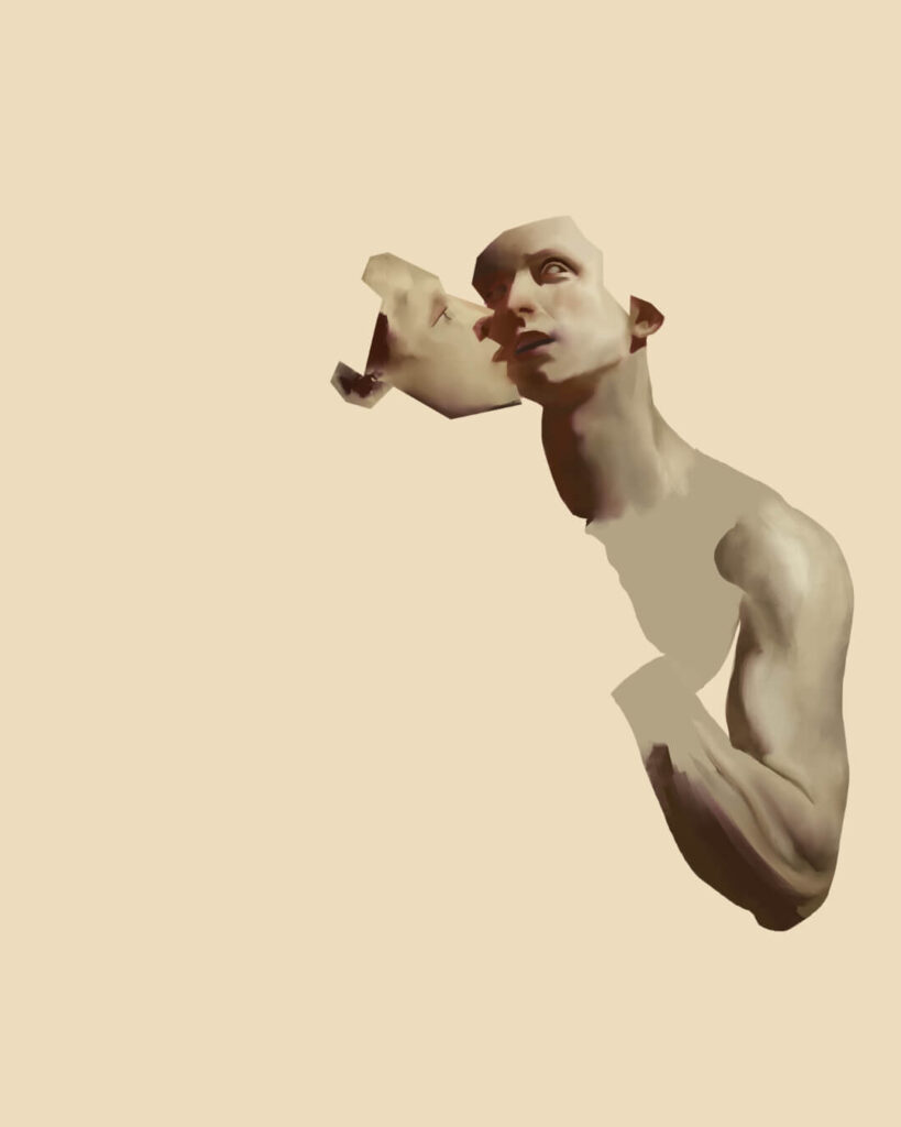
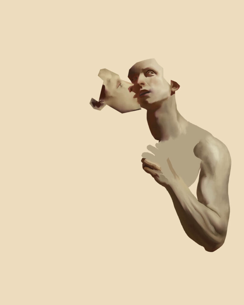
Redoing the Arm
After blocking in and rendering Lucifer’s arm, I realized I preferred the sketch’s second version instead. It provided more context to what Lucifer was whispering in Metatron’s ear and led the eye more clearly around the image. I painted the new arm in a separate layer with a similar lighting style, and, after vacillating a bit, I confirmed my decision by erasing the old arm.
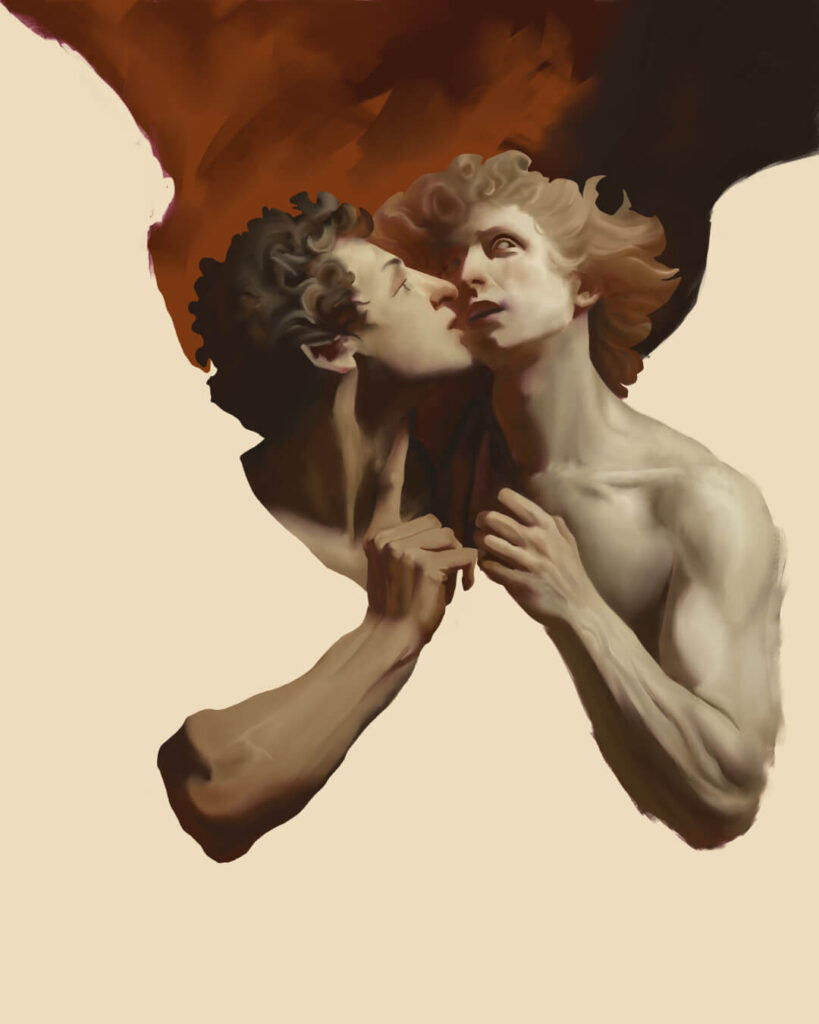
Background
I blocked in the background with a mix of burnt umber (hex code: #72340f) and raw umber/brown (hex code: #261b15). Then, I used option three on the Flat Oily 3 brush to blend the paint and left it unfinished for the time being.
Clothes and Wings
I didn’t start with a fixed plan when designing the clothing. My initial idea was to differentiate their roles through their attire: Metatron in a robe, reflecting his scholarly nature, and Lucifer in a fancier garment, similar to a Roman tunic, highlighting his role as a schemer orchestrating the downfall of heaven. I opted to keep their clothes dark so as to not distract the viewer from the narrative heart of the painting.
I struggled quite a bit with how the light should fall on the garments and ended up blocking out bigger shapes with the Knife Smooth brush. Then, I carved them down with the lasso tool so they’d look like believable folds. Finally, I blended the edges with the Flat Oily 3 brush.
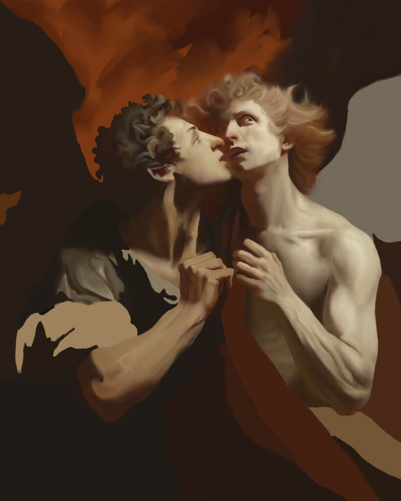
In the past, I’ve used the morning star wings from DAZ as a reference when painting my angel wings. However, since the wings weren’t a focal element of this piece, I knew a suggestive rendering would work.
The Knife Dry brush creates the illusion of traditional scumbling, which I used here for the broad strokes to give the wings more interest and appear more detailed than they are. Further rendering was done with the Flat Oily 3 brush alongside the lasso tool to refine the edges of feathers where necessary.

Clouds
Because of their abstract nature, I often find rendering clouds quite challenging. I referenced the Hudson River School painters and Baroque pieces like Figure of the Royal Magnificence, Immortality and Progress in the Fine Arts for inspiration, which helped quite a bit. I used the Flat Oily 3 for the clouds because of its ability to produce softer edges, which let me achieve a more ethereal look.


Final Touches in Rebelle
This part of my painting process involves minor adjustments and adding detail around the canvas. It can take me weeks or months to feel 100% satisfied with a painting. To maintain a fresh perspective and spot previously overlooked mistakes, I often let the piece sit for days without looking at it.
Post-Production in Affinity Photo
The post-production stage takes place in Affinity Photo. I use the same chain of adjustments for all of my paintings, tweaking parameters as needed:
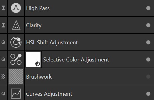
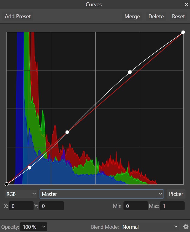
- Curves Adjustment: I use the curves adjustment to punch up contrast for the entire painting. In this case, I just applied a gentle tweak to the master channel.
- Brushwork: The brushwork layer isn’t a “filter,” but a mask that I paint over with a soft white brush to brighten main areas of the painting. The mask allows me to work non-destructively in case I want to dial back the brightness.
- Selective Color Adjustment: This layer is where I do the specific color correction work, most of which involves dropping cooler hues by 10 or 15% across the red and yellow channels. These changes help push the painting towards the temporary process called “dark yellowing” seen across many paintings from the Renaissance/Baroque era.
- HSL Shift Adjustment: Similar to the selective color adjustment, I use this filter to tune the luminosity of individual color channels.
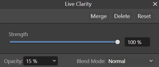
- Clarity: Clarity increases mid tone contrast in an image, essentially improving edge contrast and making the image appear sharper.
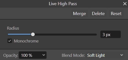
- High Pass: The high pass is the icing on the cake. Simply put, it’s a sharpening technique that retains the detail in color transitions and tones down everything around it. I use this with a very low radius setting and a soft light blend mode for a subtle tightening of the image.
Final Render and Closing
If you’ve enjoyed this detailed look at my process, you can show your support by following me on Instagram and subscribing to my YouTube channel. If you have any questions, feel free to email me or DM me on social media!
Enjoy this post? Read another!
© 2025 Visaic. All Rights Reserved.